To the letter of the law.
We aligned the possibilities of cutting-edge digital technology with the creative use of traditional media to express the corporate personality of a dynamic UK law firm. The outcome is a stunningly original identity and a suite of marketing materials that placed Bevan Brittan firmly at the forefront of a highly competitive field.
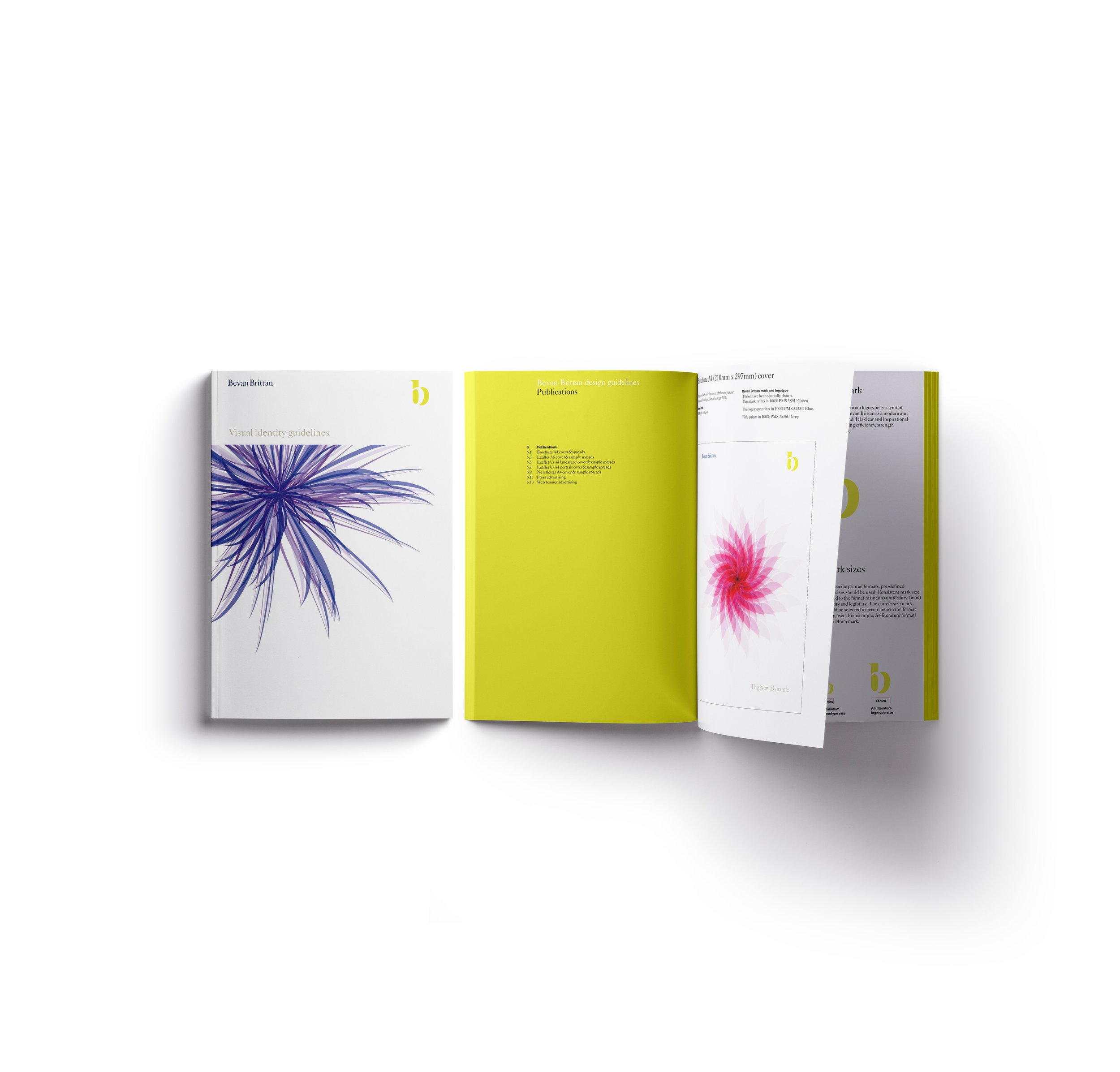
Probably the most visually stunning aspect of Bevan Brittan's public face is the digital imagery that we developed to link the firm's marketing collateral – from core stationery, corporate brochure and advertising through to electronic media, intranet and website which runs seamlessly into the architectural environment through signage
In creating a unique identity for an equally individualistic law firm we looked to capitalise on the essence of their corporate philosophy. As a case in point, the BB mark is clear, bold and unambiguous and yet, purely in graphic terms, delivers far more than is evident at first sight - there is an intriguing hint of trompe l'oeil here. The supporting logotype, on the other hand, draws on the gravitas expected of a long-established London law firm with blue-chip credentials.